While using WinSCP – an application that lets you transfer files between computers – a user came across the following dialog box:
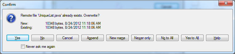
Oh, man.. There are so many things wrong with it I don’t even know where to begin.
- “Never ask me again” is evil. Once you check it (usually by mistake) you are doomed for eternity. To uncheck it you have to go through the settings and, if this dialog is any indication, I can’t even begin to imagine what that will look like. I shiver just thinking about it. Reformatting your PC is going to be easier.
- Buttons should be able to stand on their own. The label “Yes” forces you to read the text at the top while “Overwrite” immediately communicates what it does.
- The choices must be mindless and unambiguous. If “No” skips the file what does “Cancel” do? If I choose “Append” will my local file be appended to the remote file or vice versa? Which file will be kept if I choose “Newer only” (they have the same date)?Not only the choices are difficult, they are ambiguous too.
- The help should be helpful. Users typically turn to the help only as the very last ditch effort (they hate to read) so the help should be short, pertinent and to the point. WinSCP instead greets you with yet another cryptic dialog box, adding to the frustration.
- The less choices the better. Keep only what is really needed – in this case “Overwrite” and “Skip”. Anything else is better handled by a dedicated tool.
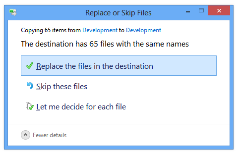
Windows 8 has the same dialog and it couldn’t be any better. Good job, Microsoft!
We developers are at a disadvantage: usability problems are not obvious to us.
- We are the ones who create the software and know all about it.
- We are more technically proficient than the average user.
- To us the software is the goal; we use it mainly to test it. To the user the software is the means; they use it to do something else. They have considerably less tolerance than us when the software gets in the way.
- We take a sense of pride in our creation and sometimes we want to implement features when they are not really needed.
Usability is extremely important: it’s what makes or breaks your product. Getting it right can be simplified down to don’t make your users think. They’ll love you for it.
Does Giving the User More Choices Create Confusion?